

You have roughly three seconds to earn a visitor’s attention, trust, and click. That is the essence of the three second rule: a website must communicate value, reassure credibility, and show a clear next step before a user decides to stay or leave. For small businesses and entrepreneurs, this moment determines whether a visitor becomes a lead or bounces away. To win it consistently, fast turnaround web design aligns speed, clarity, and conversion fundamentals so you can launch quickly and perform strongly from day one. Research frequently cited by usability leaders shows people form visual judgments in as little as 50 milliseconds, and impatience compounds on mobile. If your message is fuzzy, the layout is busy, or the page stalls, those three seconds vanish. The good news is that predictable fixes — clearer messaging, leaner pages, and a focused call to action — stack the odds in your favor.
The 3 Second Rule Explained: What It Means and Why It Matters
The three second rule is a practical guideline born from how people scan screens. In the first second, visitors answer: where am I and what is this about. In the second, they assess: is this for me and do I trust it. In the third, they decide: what should I do next. If your headline, subheading, and primary button together do not answer those questions, visitors drift. Studies often referenced by Google and independent user research firms show that clarity and speed correlate with lower bounce rates and higher conversion rates, especially on mobile where attention is fragmented. Rather than a rigid timer, think of this rule as a design contract: earn the click by removing doubt quickly.
Speed magnifies the rule’s impact. Benchmarks promoted widely in the performance community suggest that when pages take more than three seconds to load on mobile, a large share of users abandon the session. This is not just about loading bytes faster; it is about letting the user see and understand important content quickly, even while the rest of the page completes. That is why visual prioritization — ensuring the header, benefit statement, trust badges, and call to action render first — matters as much as raw load time. Add in cognitive load, and you see why minimal navigation, legible typography, and consistent spacing help visitors parse information in a heartbeat.
How fast turnaround web design turns the 3-second moment into wins
When you hear fast turnaround web design, speed of delivery should not come at the expense of strategy. The best quick builds use proven patterns that compress decision time: a headline that nails your value proposition, a relevant supporting line, a trust element such as a testimonial or accreditation, and one primary action. This above-the-fold mix works because it meets the brain’s three questions in order, without distraction. By leveraging a streamlined content process and a pre-tested component library, teams can assemble pages swiftly while still tailoring copy and imagery to your audience. That combination accelerates launch and sustains performance beyond week one.
Watch This Helpful Video
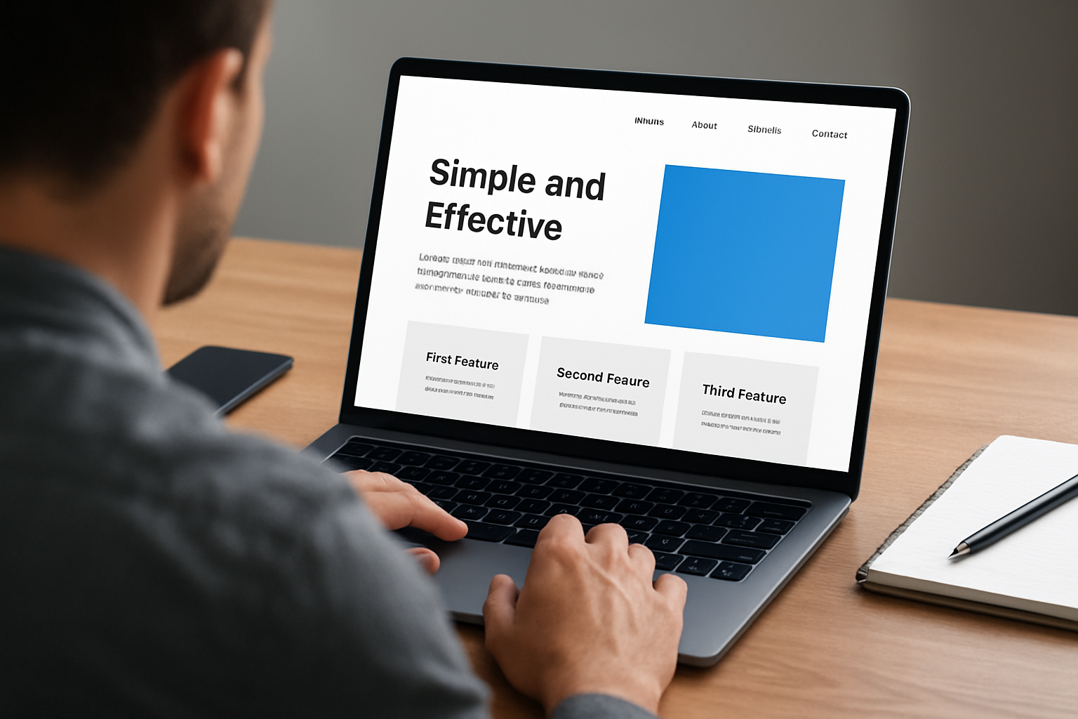
To help you better understand fast turnaround web design, we’ve included this informative video from SetupsAI. It provides valuable insights and visual demonstrations that complement the written content.
For many owners, the barrier is not knowing what to say in those crucial three seconds. A simple, repeatable formula helps: who you serve, the problem you solve, the outcome you deliver, and the action to take. Consider an electrician: “Same-day repairs without surprise costs. Local, licensed, and insured. Book a technician in minutes.” It is plain language, it reduces risk, and it offers a clear step. This is the blueprint we use at Spot On Websites to build fast, bespoke-feeling sites that read clean and convert. Want a mental picture of this layout? Imagine a 16:9 hero section with a bold headline on the left, a concise benefit line, a testimonial star rating beneath, and a single prominent button to the right.
Clarity in Three Seconds: Messaging, Visual Hierarchy, and Above-the-Fold Choices
Clarity begins with language, not code. Write your primary headline as a promise, not a slogan. Then support it with one short sentence that specifies the audience or the outcome. Next, present an unmistakable call to action that uses a verb and implies value, such as “Get My Free Quote” or “See Prices.” To reduce decision friction, highlight one core action at a time and avoid multiple competing buttons. Finally, add a light trust cue — a client logo row, a brief review snippet, or a simple guarantee line — to quiet the voice that asks, “Is this legit.” Arrange these elements top to bottom so the eye can skim naturally without guessing what matters.
Visual hierarchy is your silent narrator. Large, high-contrast type for the headline, generous spacing, and simplified navigation guide the eye from promise to proof to action in seconds. Color should emphasize the call to action and data points, not decorate for decoration’s sake. Avoid dense carousels and auto-rotating banners; they steal attention and bury key messages. A helpful visual in your mind’s eye is a 16:9 wireframe: top left logo, right-aligned navigation with few items, a wide headline block, a short supporting line, a single emphasized button, and a compact trust strip. When this structure is consistent across pages, visitors move through your site with confidence, which is exactly what the three second rule rewards.
Speed Fundamentals: Performance Metrics That Shape First Impressions
Performance is the other half of the three second equation. Focus on how fast meaningful content appears and how soon someone can interact without lag. Aim for the first screen of content to render quickly, for the largest important element such as the hero image or headline section to complete rapidly, and for interaction to feel immediate. Practical techniques include compressing images, serving next-generation formats when available, deferring non-essential scripts, minimizing render-blocking code, enabling caching, and using a content delivery network that places your files closer to visitors. Fewer files and smaller sizes mean less waiting and more reading, which nudges people toward your call to action.
Not sure where to start? Run a performance audit and track a few human-centric measures. Target a time to first byte under one second, aim for the largest element to be complete in under two and a half seconds, keep visual shifts minimal so buttons do not jump while loading, and ensure that clicks respond without noticeable delay. You do not need to memorize tool acronyms to improve speed; you need a disciplined checklist and a developer who prioritizes the first-view experience. At Spot On Websites, we bake these practices into every build so your visitors see a crisp header, a readable headline, and a tappable button almost immediately on both mobile and desktop.
Spot On Websites: Fast, Affordable, and Built to Convert
Small businesses and entrepreneurs often struggle to get a professional, lead-generating website without paying high upfront costs or ongoing fees. Spot On Websites offers a full-featured, professionally designed 10-page website package. Every site is search engine optimisation ready, mobile-friendly, and crafted to honor the three second rule from the first load to the final click. You also receive free lifetime hosting and Secure Sockets Layer (SSL) included, fixed pricing with no hidden costs, and access to 11 million stock images to elevate your visuals without months of custom shoots. Most importantly, our content writing assistance distills your value into clean, convincing copy that wins attention fast.
Because speed should never sacrifice substance, we front-load strategy. We clarify your offer, map the first click, and prioritize essential pages such as Home, Services, Pricing, About, Contact, and a high-intent lead capture path. Our professional, high-quality design system ensures a consistent visual hierarchy, while technical best practices like image compression, caching, and lightweight frameworks keep the experience snappy. The result is a site you are proud to share, ready to rank, and tuned to convert — without the stress or uncertainty that usually trails website projects.
Mini Case Study: From Blank Page to Booked-Out Quickly
A sole-trader landscaping business came to us with no website, just word-of-mouth referrals and a few social posts. We launched a 10-page site quickly featuring a promise-led headline, pricing ranges for transparency, gallery highlights, and a short form above the fold. By reducing image weight and preloading critical fonts, the first screen appeared quickly even on older phones. In the first month, they reported more quote requests than any prior month, and most came through the single, prominent “Request A Quote” button. The owner’s feedback was simple: “People get what we do immediately, and they contact us in seconds.” That is the three second rule doing its work.
Practical Checklist: Make the 3 Second Rule Work on Your Site

Turn insight into action with a lightweight checklist you can run before launch and each quarter after. Read your homepage aloud and time the first three seconds. Do the headline and supporting line clearly say who you help and how. Squint at your design preview and note what pops; if the call to action is not the most visible element, adjust color and spacing. Then open your site on a mobile connection and a mid-range phone; if the key content does not appear promptly, compress more and defer non-critical scripts. Finally, ask three ideal customers to describe your value after a quick glance; if their words do not match your pitch, tighten the message.
- Write a promise-first headline and a one-sentence support line that name your audience and outcome.
- Use a single primary call to action above the fold, with a clear verb and benefit.
- Show a trust cue early: review snippet, accreditation, or guarantee line.
- Keep navigation lean with 5 or fewer top-level items to reduce decision fatigue.
- Compress images and prioritize the first-screen content so it renders quickly on mobile.
- Use consistent spacing and legible type sizes for scanning; avoid auto-rotating carousels.
- Run a quick split test on headlines or calls to action when possible, changing one thing at a time.
- Revisit analytics to spot pages with high exits in the first few seconds and refine messaging.
Visualize your top section as a 16:9 composition for every page type: clear headline area, concise proof, and one compelling action. Repeat this rhythm on services pages and landing pages so that visitors never wonder where to look or what to do. Consistency reduces friction, and reduced friction earns you those precious three seconds across your entire website.
Common Mistakes That Break the Three Second Rule
Several patterns sabotage your first impression. The first is clever but vague copy — wordplay that hides your actual offer. Replace it with specific, outcome-focused language. The second is visual noise: too many button styles, colors, or competing boxes that pull the eye in different directions. Pare back and let your hierarchy breathe. The third is slow or unstable rendering: heavy animations, unoptimized media, or layout shifts that cause buttons to jump just before a tap, which frustrates users. Lastly, asking for too much too soon — long forms or pop-ups immediately overlaying the content — interrupts momentum. Earn engagement with value, then ask.
If you recognize any of these on your site, do not panic. Prioritize fixes that influence what appears and what is understood in those first seconds: message clarity, primary action, and initial load. Quick wins here often deliver disproportionate gains in lead volume and perceived professionalism. This is exactly where a focused partner like Spot On Websites brings structure, momentum, and accountability to move from diagnosis to measurable improvement swiftly.
Frequently Asked Questions About the Three Second Rule
Is three seconds a hard limit. No. It is a practical benchmark that keeps your team honest about clarity and speed, especially for mobile visitors who scan quickly. Can a complex product obey the rule. Yes. Put the clearest benefit and the next step upfront, then layer detail below for people who want to explore. How do I measure success. Track time on page, scroll depth, and the click-through rate on your primary call to action for the hero section. If more people click the top button and form completions rise, your first impression is working. Should I prioritize aesthetics or speed. You do not have to choose when you design with a clear hierarchy and keep assets lean; you can look great and load fast.
Your goal is simple: make strangers understand your value and feel safe to act within three seconds. Imagine a year from now, your site greeting each visitor with a crisp promise, social proof, and a lightning-fast path to contact. What would it mean for your calendar, your leads, and your confidence to nail that first impression every single time with fast turnaround web design.
Additional Resources
Explore these authoritative resources to dive deeper into fast turnaround web design.
Spot On Websites: Launch Your 10-Page Site Fast
Get fast turnaround web design with a 10-page website package, search engine optimisation ready with free lifetime hosting, so your small business wins more leads without hidden costs.
0 Comments